Icons
Icons usage and available icons library.
Icon Usage
The primary way to use icons is inside any label text on the chart. Here's an example
{
  title_label_text: "<icon name=system/default/settings size=16> Settings used most often"
}
See the Labels Tutorial for more information on using icons in label text.
System icons
There are a number of system icons that are bundled with JSCharting including generic system specific icons. For example, iOS and android both have export icons with the same meaning, but different visuals.
The bundle includes these icons for the following OS'es:
- iOS
- Android
- Windows Phone
- Default
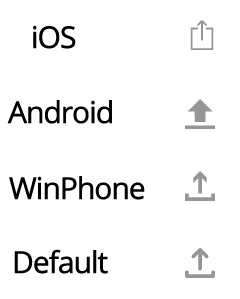 Figure 1.
The export icon will automatically display a version that correspond to the end users OS.
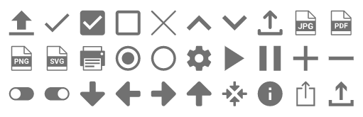 Figure 2.
- system/android/export
- system/default/check
- system/default/checkbox
- system/default/checkbox-blank
- system/default/close
- system/default/expand-less
- system/default/expand-more
- system/default/export
- system/default/jpg
- system/default/pdf
- system/default/png
- system/default/svg
- system/default/print
- system/default/radio-button
- system/default/radio-button-blank
- system/default/settings
- system/default/play
- system/default/pause
- system/default/add
- system/default/remove
- system/default/toggle-off
- system/default/toggle-on
- system/default/zoom/arrow-down
- system/default/zoom/arrow-left
- system/default/zoom/arrow-right
- system/default/zoom/arrow-up
- system/default/zoom/zoom-out
- system/default/info
- system/ios/export
- system/winphone/export
3rd Party Library
Also included is a vast collection of 3rd party icon libraries located under the JSC/ folder that can be referenced in script tags. When they are referenced, they will be accessible through the icon.name property.
Icons Browser
The icons browser can be used to find or browse the available icons library. When an icon is clicked, the path for the icon is shown at the top. This path can be used to specify the selected icon in chart configuration.
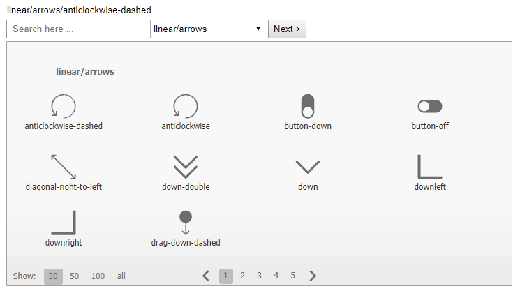 Figure 3.
When using icons, the chart will add a note to console that specifies the icon can be added to the page in a <script> tag like so:
<script type="text/javascript"
src="../JSC/icons/material/hardware/keyboard-arrow-left.js"></script>
If many icons from the same category are used, it is best to include them all as one file like so:
<script type="text/javascript"
src="../JSC/icons/material/hardware/all.js"></script>
Custom
In addition to the predefined icons, a custom icon can also be used by setting the icon.path property with an SVG path string. The chart will handle any resizing and other manipulation as needed.
Using custom icons
- Use custom paths with closed shapes which terminate with a 'z' character.
- Multiple paths can be combined by simply concatenating them into a single path string.
Icon Features
Common styling features such as fill, outline, margins, and sizing are all available with icons.
Outer Shape
The icon.outerShape property can be set with a chart markerType such as circle square etc. This will modify the icon by cutting the icon path out of the outer shape. The padding property provides control over the spacing between the icon and outer shape.