Circular Gauge
Gauge type specific features.
Gauge types
Circular gauge types provide many features with flexibility to create a wide range of visualizations. The radial charts support virtually all the same axis features as normal charts except they are curved around a circle.
Classic Gauges
When the chart type property is set to 'gauge', classic needle gauges are used by default. Internally the default series type is set to marker and defaultPoint.marker.type is set to 'needle'. When different series/marker types are specified, modern gauges are used. Needle lengths and ranges can be controlled by the point.marker.length property.
Simple Gauge Chart Sample Demonstrates setting needle lengths and ranges.
Size of the center needle base cap of the gauge that needles start from can be modified through the shape.innerPadding property like so:
{
  defaultSeries_shape_innerPadding: 0.5
}
To make the cap smaller, positive values from 0 to 1 can be used. Negative values will make it larger.
For more detailed information on classic gauges, please refer to this tutorial: Classic Gauge Tutorial
Modern Gauges
Modern gauges are standard horizontal charts projected around a circle or arc. All axis features are supported just like with standard charts but some default settings may differ between standard and different circular chart types. For example, X axes are not visible by default on circular gauges but all X axis visuals can be enabled.
Circular Grid Column Chart Sample Shows all visual elements of both X and Y axes.
OnTop Features
Each axis visual element can be set to render on top of data visuals by setting the onTop property to true. The following items include onTop settings to modify where it renders.
When axis elements render behind data, the axis line renders on top of grid lines by default, but if axis.line.onTop=false is set explicitly it will make gridlines render on top of the axis line.
Circular Gauge Shape Labels Sample Multiple shape labels used on a circular gauge.
Axis Tick Label Placement
Outer axis tick labels on circular charts can render inside or outside the circular chartArea using the label.placement property. The default placement can differ between gauge types but can also be set explicitly as in this snippet:
{
  yAxis: {
    defaultTick_label_placement: "inside"
  }
}
Circular Tick Placement Sample Circular axis tick placement options.
Circular Columns
Circular columns have some unique behaviors that cater to modern dashboard needs.
Column Overflow
When Y axis range is 0-100 on a full circle, and the column values are larger than that range (say 200), the visual will spiral over top of itself. Columns can spiral this way repeatedly and the shape will not represent the column value because 200 will look the same as 300, 400, and so on. However, there is a color cue that indicates the number of times the column overlaps itself through a change of the column hue.
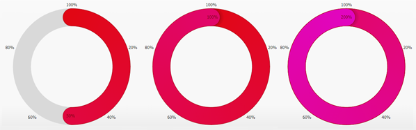 Figure 1.
This hue change can be disabled by setting 'column solid' series type.
Span Axis Origin
Sometimes it is necessary for a column to span the origin on the axis. For example if axis range is 0-12 representing a clock and a column must be drawn clockwise between 10 and 2, this can be accomplished by setting the point y value with [10,2]. When the first value is larger than the second value, the chart will assume the point range should span the axis origin.
Circular columns don't support all column shading effects, but they do support roundCaps.
Circular Sleep Tracking Gauges Sample Circular bars that span axis origin.
Grid Line Column Guide
A common linear or circular column gauge feature is drawing the full path the column can fill behind it. To replicate this visual X axis grid lines can be used. Setting grid line width to 'column' makes the grid lines match column widths and caps to replicate this visualization.
{
  xAxis: {
    defaultTick_gridLine_width: "column"
  }
}
 Figure 2.
Circular Arc Sweep Guides Sample Examples of visual guides for circular gauge columns.
Linear Gauge Axis Guides Sample Examples of visual guides for linear gauge columns.
Gauge Shape Labels
Gauges including radar, circular, and linear support labels than can be positioned outside or inside the gauge. Multiple labels with different alignments can be used on a single gauge.
Circular Gauge Shape Labels Sample Multiple shape labels used on a circular gauge.
Circular Point Marker Rotation
Point markers on radars or attached to circular columns don't rotate by default, however, by setting marker.rotate='auto' markers will orient their "up" direction to point away from the circular center. Auto rotation can be confusing if used on radars with many different markers, but can be useful in some cases as in this sample:
Circular Column Markers Chart Sample Custom and automatically rotated point marker shapes on circular bars.
In addition, rotation also supports a numeric angle in degrees.
| Page | Description |
|---|---|
| Classic Gauge | Gauge type specific features. |