Examples
A more advanced walkthrough with real-world examples.
Examples
A simple button
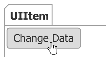 Figure 1.
A button is the simplest kind of uiItem. It only requires a click event handler. The item's name automatically populates the label text. This can add rich functionality with very little effort:
JSC.Chart({
  toolbar_items: {
    "Change Data": {
      events_click: function(v, item) {
        item.chart.series(0).options(getData());
      }
    }
  }
});
A checkbox item
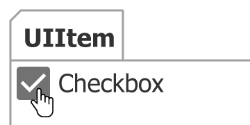 Figure 2.
First lets look at the fundamental way to define a checkbox item:
JSC.Chart({
  toolbar_items: {
    Checkbox: {
      type: "option",
      label_text: "Checkbox",
      icon: "system/default/checkbox-blank",
      states_select_icon: "system/default/checkbox",
      events_change: function(val) {
        alert(val);
      }
    }
  }
});
As you can see, the checkbox icon name must be specified as well as the icon name used when the item value is true. This can be simplified using shortcut type:
JSC.Chart({
  toolbar_items: {
    Checkbox: {
      type: "checkbox",
      events_change: function(val) {
        alert(val);
      }
    }
  }
});
Classic dropdown
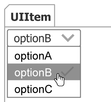 Figure 3.
This simple dropdown sample was used in the overview, but it was not wired up to any events. The snippet below shows a fully functional dropdown.
JSC.Chart({
  toolbar: {
    items: {
      "simple dropdown": {
        type: "select",
        value: "optionB", //Sets the initial value
        items: {
          optionA: {},
          optionB: {},
          optionC: {
            events_change: function(val) {
              //This function runs only when optionC is selected or deselected and the argument passed is a Boolean representing the items select state.
              alert("optionC has changed to: " + val);
            }
          }
        },
        //This event is fired when the value of the dropdown changes.
        events_change: function(val) {
          //The val argument is a string name of the selected item.
          alert("The selection has changed to: " + val);
        }
      }
    }
  }
});
Dropdown with multiple item selection
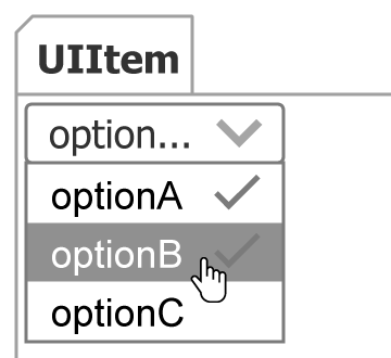 Figure 4.
JSC.Chart({
  toolbar: {
    items: {
      "simple dropdown": {
        type: "selectMultiple",
        value: "optionA,optionB", //Sets the initial value
        items: ["optionA", "optionB", "optionC"],
        events_change: function(val) {
          //The val argument is a comma delimited list of the selected items.
          alert("Selected options are: " + val);
        }
      }
    }
  }
});
A non-interactive indicator
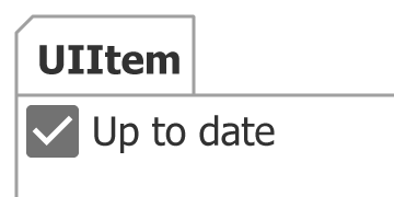 Figure 5.
This uiItem would normally behave as a button where the value is only true when the button is depressed, however, when the type is set to 'option' explicitly, it means the item will toggle the value on click. By returning false in the click event, the item state will not toggle and hence is not an interactive item.
var chart = JSC.Chart({
  toolbar: {
    items: {
      DataCurrent: {
        type: "option",
        value: true, //Sets the initial value
        icon: "system/default/checkbox_blank",
        label_text: "Up to date",
        states_select_icon: "system/default/checkbox",
        events_click: function() {
          //By returning false, the default click action of an option type (toggling state) is disabled
          return false;
        }
      }
    }
  }
});
A file item
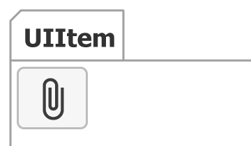 Figure 6.
JSC.Chart({
  toolbar: {
    items: {
      "CSV files": {
        type: "file",
        position: "top left",
        accept: ".csv",
        events_change: function(files) {
          processSelectedFiles(files);
        }
      }
    }
  }
});
A radio item
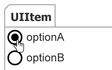 Figure 7.
JSC.Chart({
  toolbar: {
    items: {
      radioOptions: {
        type: "select",
        position: "top left",
        label_text: "",
        itemsBox_visible: true,
        // Each child item type being set to 'radio' causes selection to be mutually exclusive.
        defaultItem_type: "radio",
        items: "optionA,optionB"
      }
    }
  }
});
A range item
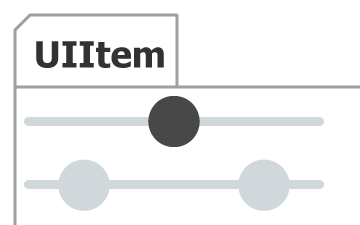 Figure 8.
JSC.Chart({
  toolbar: {
    items: {
      "range bottom": {
        type: "range",
        // Initial slider value
        value: 0.5,
        // Width of the slider
        width: 200,
        // Size of the handles
        height: 20,
        events_change: function(range) {
          console.log(range);
        }
      },
      "multiple range bottom": {
        type: "range",
        //Two value slider
        value: [0.2, 0.8],
        // Value range
        min: 0,
        max: 1,
        // Width of the slider
        width: 200,
        // Size of the handles
        height: 20,
        disabled: true,
        events_change: function(range) {
          console.log(range);
        }
      }
    }
  }
});
A toggle item
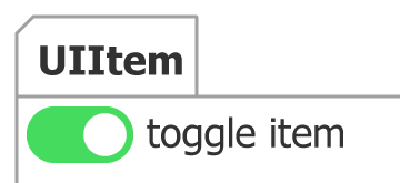 Figure 9.
JSC.Chart({
  toolbar: {
    items: {
      "toggle item": {
        type: "toggle",
        value: true,
        events_change: function(val) {}
      }
    }
  }
});