Classic Gauge
Gauge type specific features.
Introduction
The gauges are represented by series where each point of the series represents a gauge needle. The point marker.length values represent the needle lengths.
Multiple series can also be combined into a single gauge where each needle is represented by the sum of a series y values. In such a case, the series default point can be used to define the marker.length value indicating needle length.
Single Gauge
A single gauge chart is achieved by setting the chart config type property to 'gauge' defined by the chartType enum.
{
  type: "gauge"
}
When the chart has only one series, each point of that series is shown as a gauge needle.
When the chart has multiple series, the sum of each series y values is represented by a needle.
Multiple Gauges
Multiple gauge charts are achieved by setting the chart config defaultSeries type property to 'gauge' defined by the chartType enum.
{
  defaultSeries_type: "gauge"
}
Axis Settings
Single Gauge Axes
In a single gauge chart, the main chart config property chart.yAxis defines the gauge axis settings.
The following code specifies scale ranges for the Y axis on the gauge chart.
{
  /*Single Gauge Chart*/
  type: "gauge",
  yAxis: {
    scale_range: [0, 100]
  }
}
Multiple Gauge Axes
Each gauge can have its own Y axis. However, if an axis is not specified for the series, the main axis or the first axis in the yAxis array is used.
{
  defaultSeries_type: "gauge",
  yAxis: [
    {
      scaleRange: [0, 80],
      defaultTick_label_color: "orange"
    },
    {
      id: "y2",
      scaleRange: [0, 200],
      defaultTick_label_color: "blue"
    }
  ],
  series: [
    {
      points: [
        {
          y: 65,
          z: 0.8
        }
      ]
    },
    {
      yAxis: "y2",
      points: [
        {
          y: 45,
          z: 0.8
        }
      ]
    }
  ]
}
The above code creates the following multiple gauge chart.
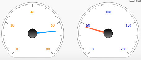 Figure 1.
Axis Markers
Needle Length
The marker.length value specifies the needle length. The value must be between 0 and 1 where 0 has no length, and 1 is the max possible needle length.
If the value is not specified the needle lengths default to .8.
Setting a start and end value such as [.2,.9] is also supported.
The following code and image demonstrate the needle length behaviors:
{
  type: "gauge",
  yAxis_scale_range: [0, 80],
  series: [
    {
      palette: "default",
      points: [
        {
          y: 40,
          marker_length: 0.2
        },
        {
          y: 45,
          marker_length: 0.5
        },
        {
          y: 50,
          marker_length: 1
        }
      ]
    }
  ]
}
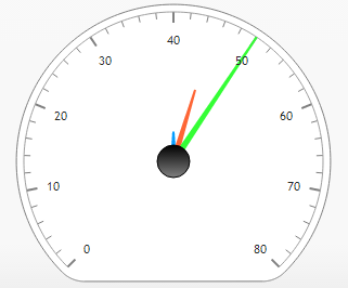 Figure 2.
Styling
Angles And Arcs
Starting and ending angles can be used together to define the gauge arcs as with the following example.
{
  defaultSeries_angle: {
    start: 80,
    end: 100
  }
}
The following has the same effect as the above start and end angle settings, however, it is given in orientation and sweep which makes it easier to think about.
{
  defaultSeries_angle: {
    orientation: 90,
    sweep: 20
  }
}
Sweep can be given in numeric degrees or as a percentage string such as '50%' which is equivalent to 180 degrees.
Clipping
Gauges utilize a clipping algorithm to maximize gauge sizes. The following sample illustrates clipping of different arc sweeps.
{
  defaultSeries_type: "gauge",
  series: [
    {
      points: [
        {
          y: 65
        }
      ]
    },
    {
      angle_sweep: 180,
      points: [
        {
          y: 45
        }
      ]
    },
    {
      angle_sweep: 100,
      points: [
        {
          y: 45
        }
      ]
    }
  ]
}
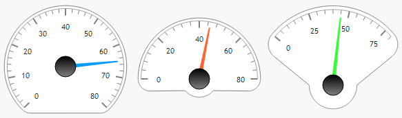 Figure 3.
This clipping behavior is the default but can be disabled to produce a standard circular gauge despite the gauge arcs. This option is defined within the chart type enum chain.
{
  defaultSeries_type: "gaugeCircle"
}
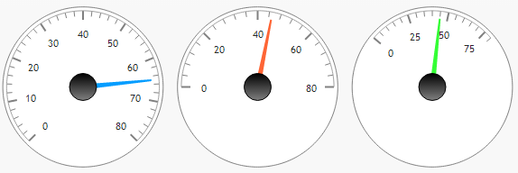 Figure 4.
Backgrounds
The series shape property allows setting the fill of the individual gauges the series is plotted on.
The following example shows how to specify the background shading of 3 different gauges.
{
  series: [
    {
      shape_fill: "#fff0f0"
    },
    {
      shape_fill: "#f0fff1"
    },
    {
      shape_fill: ["#a0f1ff", "white", 45]
    }
  ]
}
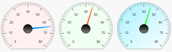 Figure 5.
Layout
Scaling
Depending on gauge arc angles, gauges are overall smaller than they would be as a full circle. JSC scales these up to match the width or height of all other gauges as seen in figure 3.
Default Layout
Gauge layout uses an algorithm that determines the most efficient number of columns and rows to maximize gauge sizes.
Padding Gauges
In cases where gauges or other similar series are too crowded, a general padding value can be applied for all gauges on the chart.
{
  defaultSeries: {
    shape_padding: 0.2
  }
}